The workaround for creating tasks isn't ideal
I'm trying to describe what happens time and again when you create tasks.
When creating tasks, the title field opens immediately for editing.
Here, you often have to click several times to get to the end of the selected text so you can delete it. (Of course, deleting from the end removes the text.)
To navigate to a specific spot within the text—for example, just to change the top number—requires at least two clicks, provided the preceding point is recognized. This is because step 1 is necessary just to get to that spot in the text.
I don’t know if there’s a better way to program this, but it’s just a bit tedious and time-consuming sometimes
Then you’re prompted to save in the top right or close on the left.
If you click Save, the task is created and closed immediately.
The assignment is then automatically set to yourself.
To change this, the task must be reopened, which not only ensures that the creation process isn’t smooth.
It would make more sense if there were not just an X here, but a checkmark that takes you back to the task creation screen.
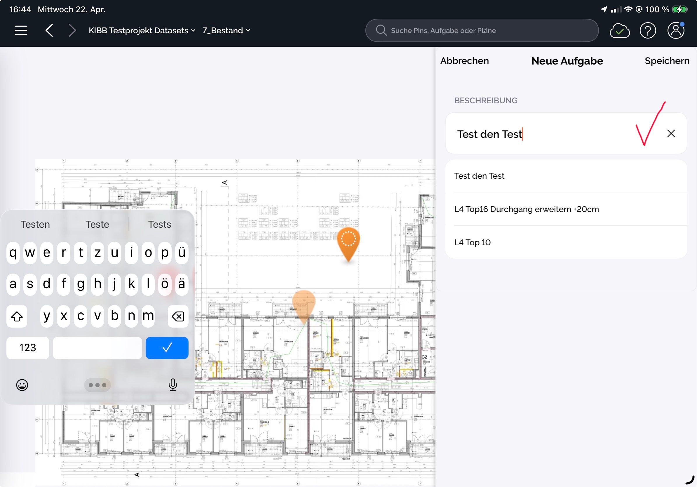
And the “Done” button is too prominent. You keep accidentally clicking it. I think a slider would make sense for both “Done” and “Reject”:
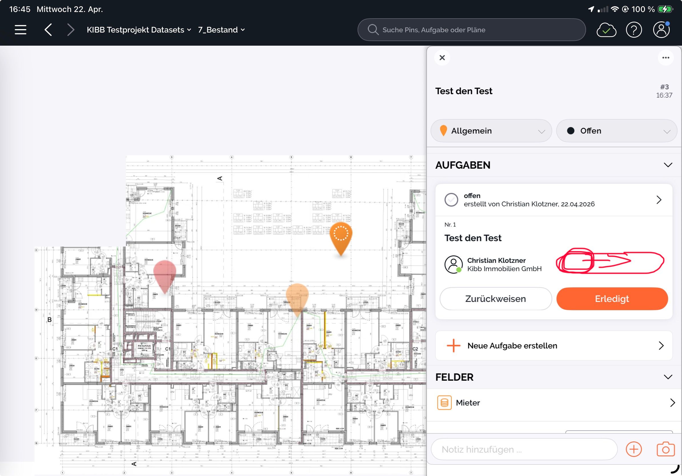
Please improve the workflow—it’s not ideal.
Thank you very much
Best regards, Christian
Please authenticate to join the conversation.
wird überprüft
Mobiles Arbeiten & Sync
4 months ago

Christian Klotzner
Subscribe to post
Get notified by email when there are changes.
wird überprüft
Mobiles Arbeiten & Sync
4 months ago
Christian Klotzner
Subscribe to post
Get notified by email when there are changes.